THE REQUEST
Design a logo for a newly opening candy store in Aspen, CO. named Candy Doc which takes a nostalgic twist on favorite old-fashioned candies in hopes to help cure what ails you. Much like the Pharmacies of the past that housed a soda fountains to help take your medicine, these small bites pack big memories of childhood fun.
THE RESULT
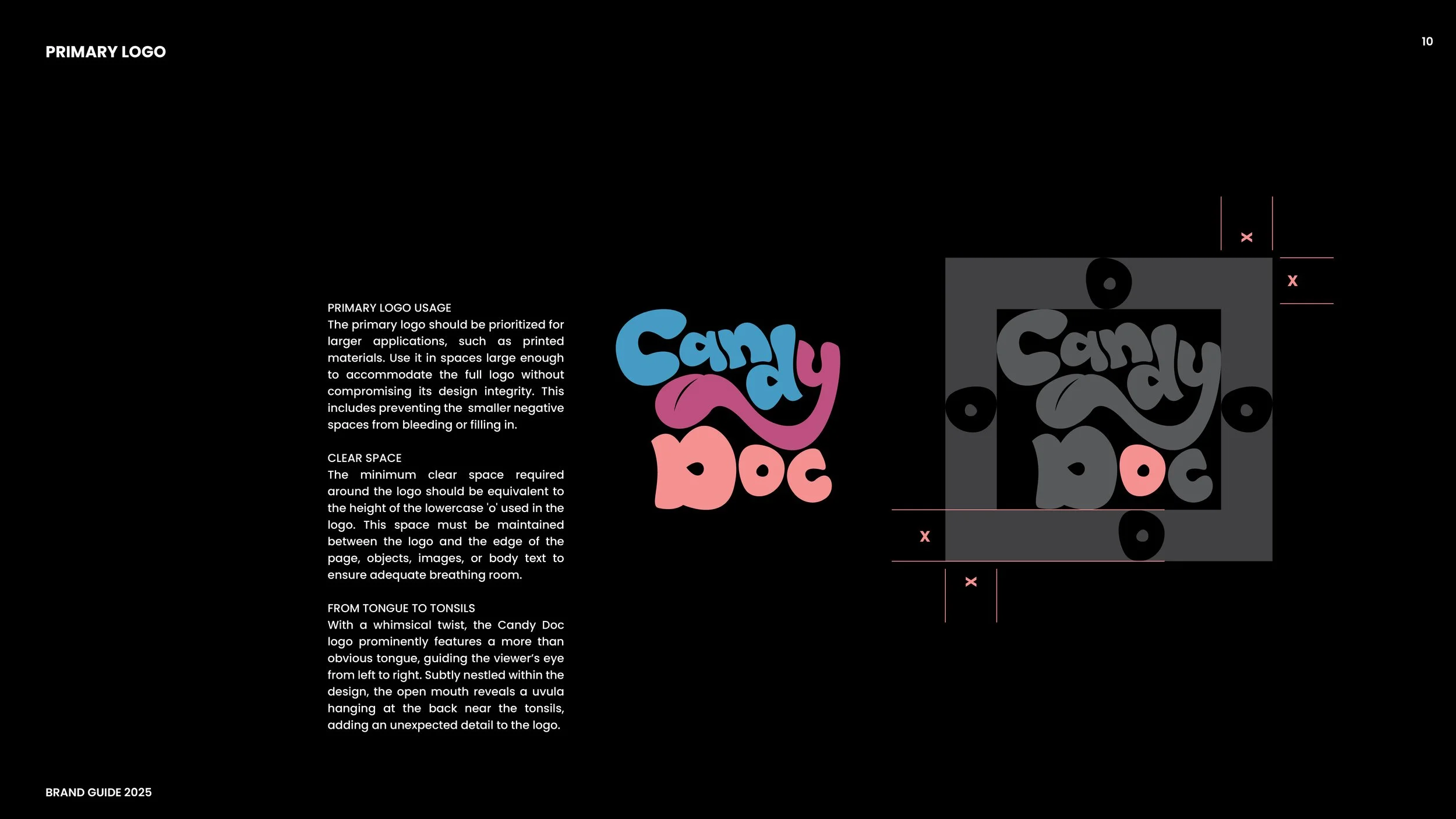
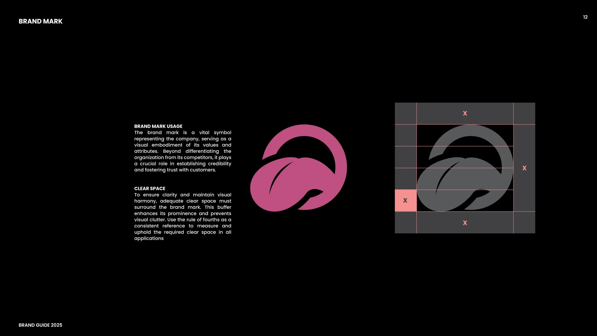
While the bright colors help lead passersby to the thought of potential layers of refreshing, sweet and sour flavors only steps away, the hand-drawn characters of this logo ease their way to the lowercase 'y' which serves as the playful focal point of the logo. Representing a tongue and tonsil the logo presents itself to the viewer as having a playful, uninhibited vibe by showing its whimsical side, full of movement and carefree energy.