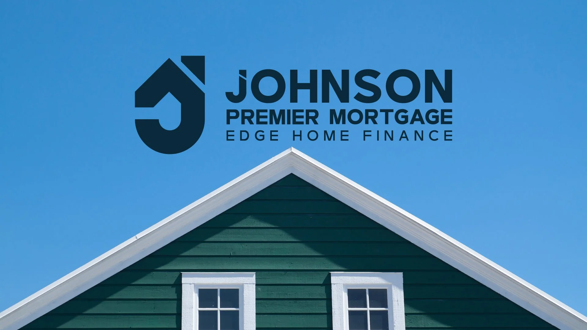
Understanding the Brand
The logo design process began by defining the emotional and strategic core of Johnson Premier Mortgage. The brand needed to convey long‑standing trust and credibility while still feeling modern, efficient, and approachable. At the heart of the identity is the idea of “timeless trust, modern simplicity in home financing,” a promise meant to reduce anxiety and build confidence around major financial decisions. The name hierarchy reinforced this intent: “Johnson” serves as a legacy anchor that implies personal accountability and history, “Premier Mortgage” supports professional credibility, and “Edge Home Finance” quietly adds institutional strength. From the outset, the logo needed to communicate competence, stability, and reassurance—signaling that this is an established partner capable of making a complex process feel manageable.
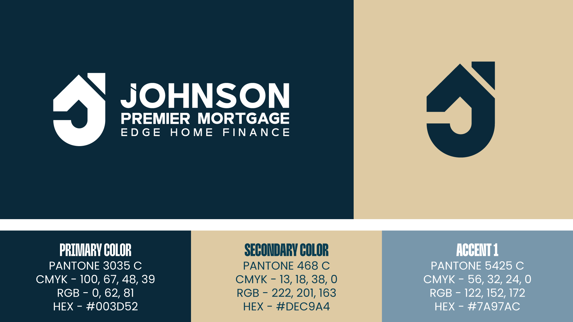
Strategic Design & Positioning Framework
With the brand clearly defined, strategy shaped how those values would translate visually. The logo needed to balance tradition and modernity—projecting experience, security, and professionalism while remaining clean, efficient, and contemporary. Design cues associated with trusted legacy brands guided the direction: restrained color palettes, confident typography, minimal composition, and purposeful use of negative space. Serif influences hinted at heritage, while modern spacing and clarity emphasized ease and speed. Muted blues and refined gold tones were explored to communicate reliability and elevated quality without feeling flashy. Every choice was measured against a central question: does this feel established and trustworthy, yet simple and modern enough for today’s borrower?
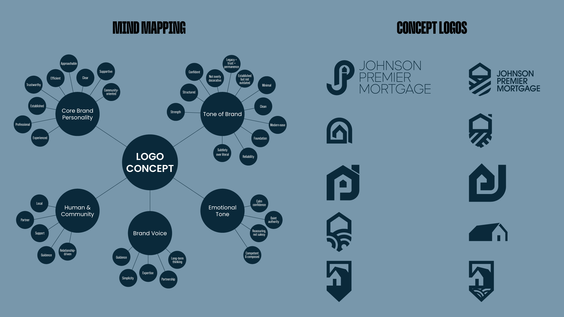
Brainstorm & Mind‑Map
The final phase focused on translating strategy into visual concepts through brainstorming and mind‑mapping. Exploration centered on subtle, symbolic forms rather than literal imagery—monograms, abstract shields, pillars, keystones, and framed geometries that quietly suggest protection, structure, and long‑term stability. Geometry played a key role, using balanced shapes to evoke security and community, while typography was refined to feel bold, disciplined, and professional without becoming rigid. Through iteration, the logo evolved into a composed, confident mark that feels quietly authoritative and reassuring. The final result reflects a brand that is experienced but not outdated, premium but not intimidating, and designed to inspire trust while promising a smooth, modern home‑financing experience.